THE CLIENT: ![]()
THE PRODUCT: Virtual Assist (VA) is a web-streaming tool that connects Auto Body Shops or Customers directly to an Adjuster when contesting the price for fixing a damaged vehicle.
Prior to VA, this process would have involved an adjuster going onsite to an auto body shop, which would have taken up to 4 days. Now, the entire process takes an average of 46 minutes.
To see the latest and greatest, download Virtual Assist in the Android or iOS app store!
ROLE: Product Designer (Research, UX, User Testing, UI)
PROCESS SNAPSHOT:
This is one iteration of the Agile XP design process.
- Learn about a user
- Identify a problem
- Ideate on solutions
- Test solution
- Evaluate results
- Tweak design as needed or implement UI
THE USER

Auto Body Shop Owners/Employees: Most often these are small shops where the owner is the primary user of VA. They tend to be:
- 50+ in age
- Low to moderate technology use
- The sole user of the app within their shop
THE PROBLEM
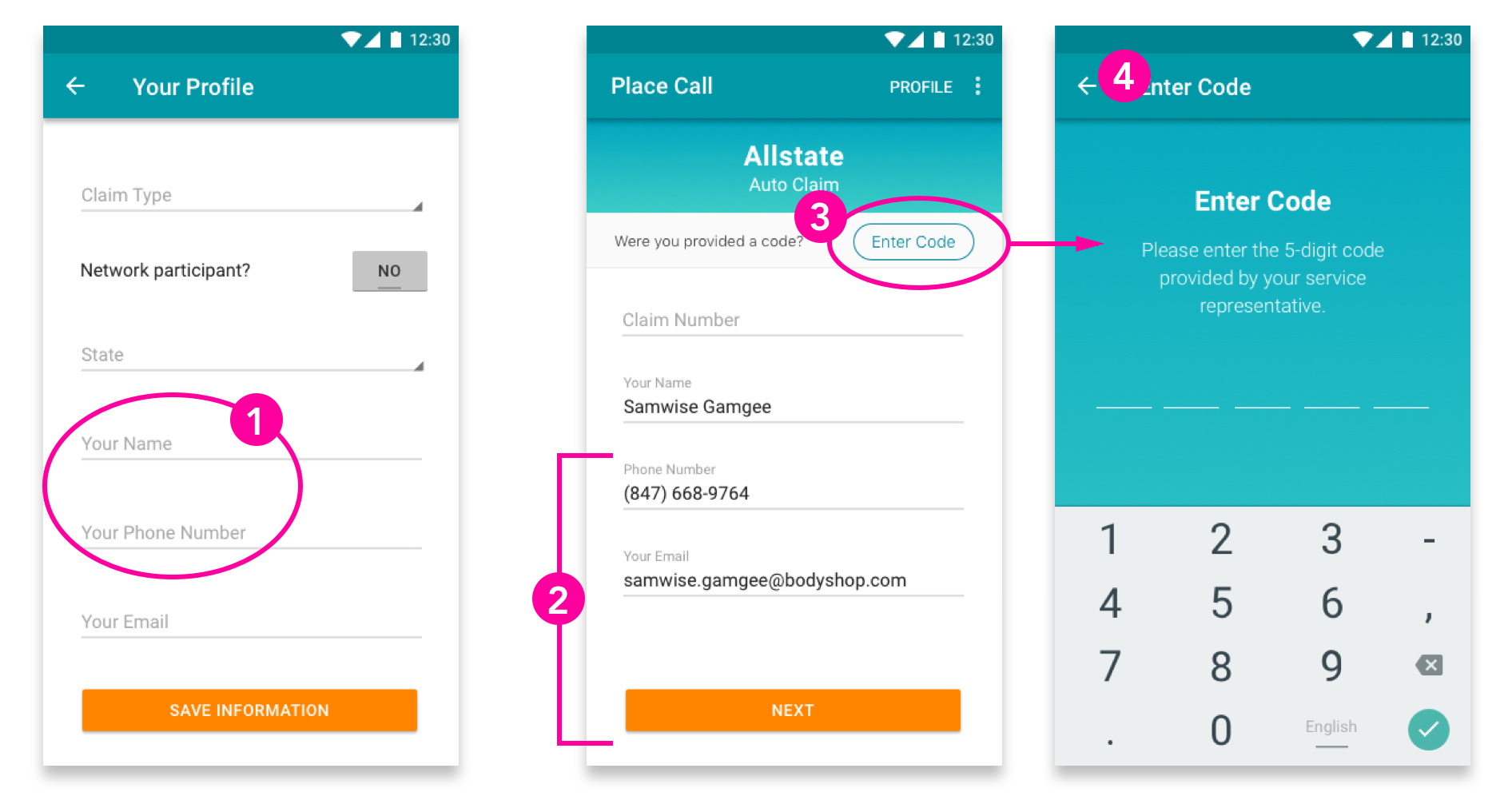
Many users put the name of their shop and shops' phone number instead of their name. This is important, because when disconnected, an Adjuster will call the shop and not know who to ask for.
This is redundant information from the previous screen! Many users would see this screen and hit ‘Next’, thinking that the page was complete only to receive an error after. Additionally, this information seems to never be altered.
There is no explanation for what the ‘Enter Code’ button does! Some users could click it because they thought it was required when it is not.
For users who accidentally got here, it took time before they realized they had to click the ‘back’ button to get to the previous screen.
ACTIONS
Taking these problems into consideration, I created a series of solutions, some of which I mocked up and tested with users using inVision prototypes. These were the end result:
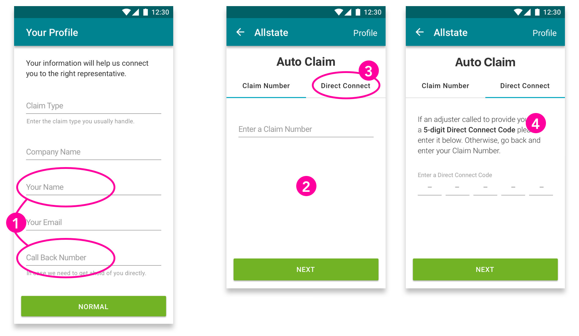
By adding an input for ‘Company Name’ we’ve had nearly ALL USERS inputting their name! (First and sometimes last.)
Before, the ‘Enter Code’ seemed like a command. Working with a content strategist we changed the CTA to ‘Direct Connect’ to make the copy feel less mandatory.
We removed the redundant profile information. When asking users how they would edit their information they knew to go to ‘Profile’.
We made the ‘Claim Number’ and ‘Direct Connect’ sections into Tabs. This is because a user will do one or the other of these, and it seemed to provide the user with a greater level of affordance.
Results
We have been hearing significantly fewer complaints from our users in these areas. Additionally, our retention rate has increased significantly and Virtual Assist now handles 50% of all supplements at Allstate!
Next Steps
- Continue Testing and improving the apps
- Ensure WCAG AA accessibility standards
- Expand to secondary user cases/personas
- Speak with Adjusters to gather more information
- Create a Mobile App for Customers