THE CLIENT: ![]()
THE PROBLEM: Marriott International’s new boutique brand Moxy Hotel caters to millennial business travelers. Their existing site, while aesthetically “cool”, offered no new features to appeal to their users. My team of three was tasked with:
1) Creating a responsive site that would work well on mobile, tablet, and desktop.
2) Catering to millennial international business travelers.
3) Generating ideas for hospitality features, and social means for guests in communal spaces to easily connect, while still respecting guests who prefer quiet and/or work spaces.
ROLE: Product Designer (Research, UX, User Testing, UI)
TIME FRAME: 2 Weeks
STEP 1: THE WHAT
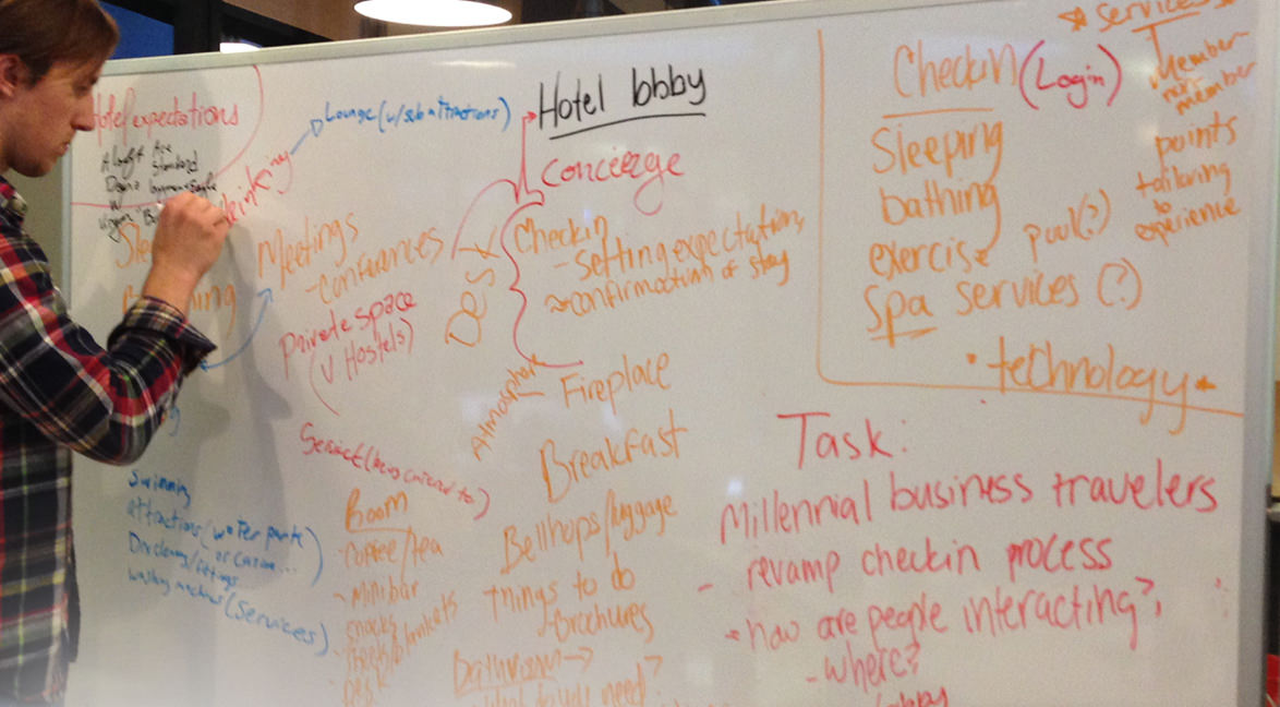
STARTING POINT: What were the hotel's guests' expectations? What elements, both service and spaces, are common in hotels?
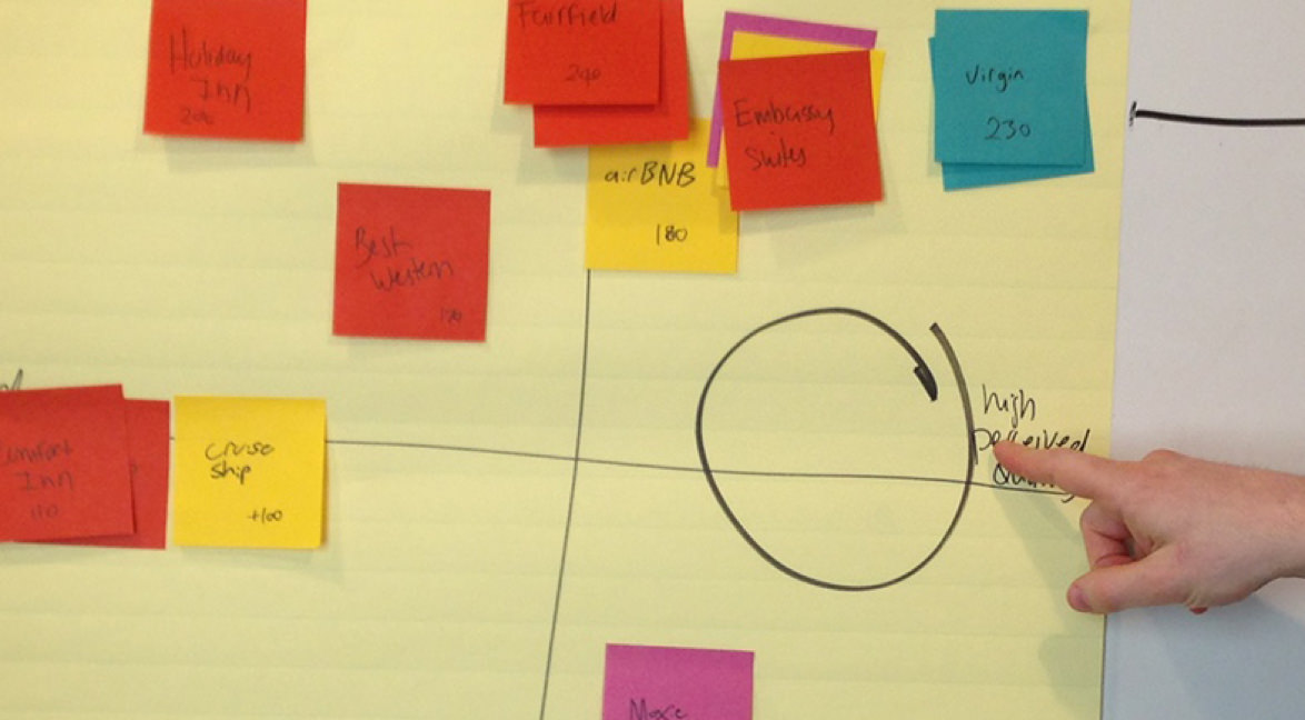
COMPETITIVE ANALYSIS: Taking a broader view of the hotel experience, we created several 2x2’s noting price, status, quality, amenities, etc. The result was a notable gap in the market for high quality, low frills, low cost lodging.
STEP 2: THE WHO
PERSONA GATHERING: The initial task was to uncover what our users wanted from their hotel experience. However, in order to do this, we had to seek out those millennials who traveled for business rather than just pleasure. This took the form of both surveys and interviews. In addition, my team and I went onsite to various boutique hotels in downtown Chicago which we deemed competitors during our competitive analysis. This was beneficial both in determining how the common spaces were laid out, and observing how the clientele interacted with those spaces. Based on the research three clear personas emerged:

Steve: The ambitious business traveler who works hard with no play. He needs a quiet place to work and prepare for meetings.

Eloise: The business traveler who takes on more long-term opportunities. She may stay in the same hotel for months and enjoys exploring whatever city she’s visiting.

Tanner: Another frequent business traveler who is more interested in socializing and meeting new people than work.
OVERVIEW: Our demographic have specific needs, like the need for WiFi (and free WiFi is even better), especially if the guest needs to work. The Moxy Hotel guests expect to be able to do what they want when they want. They expect self-service and value autonomy. The hotel experience would have to be pleasurable while still encouraging productivity.
RECOMMENDED SOLUTION: In the spirit of autonomy, hotel guests would know their room number in advance and have the ability to use their phone as a key to enter their room. They should also be able to check-in and checkout from their phone. Imagine, one could by-pass the front desk all together.
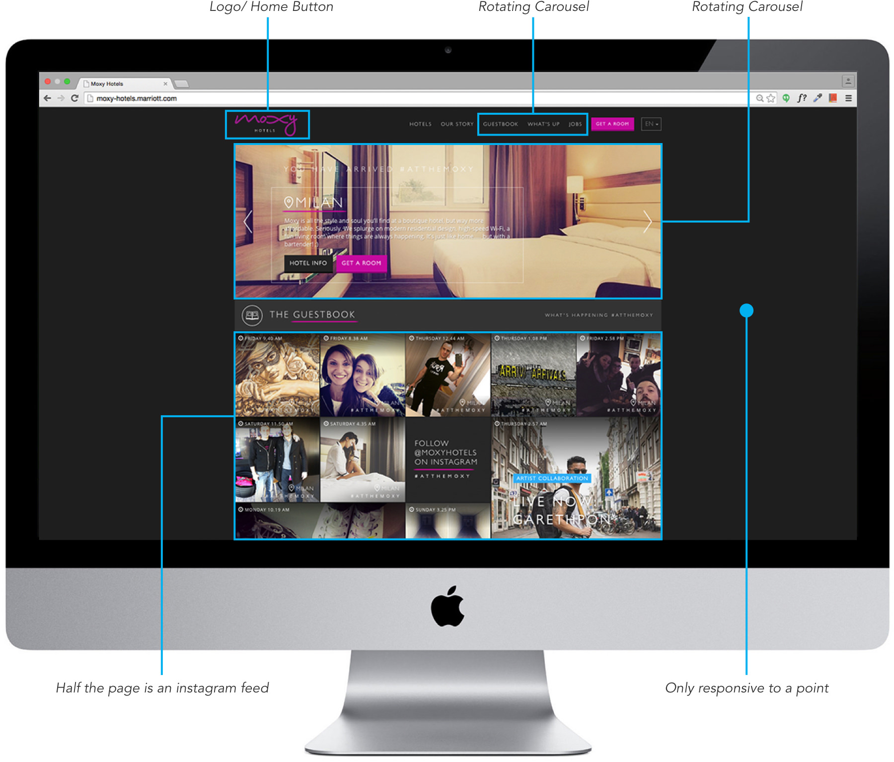
Content Evaluation: While the site looked great the bulk of the content did not meet the functional imperative. We thought the real estate could be better utilized.
STEP 3: THE HOW “LET'S GET CREATIVE”
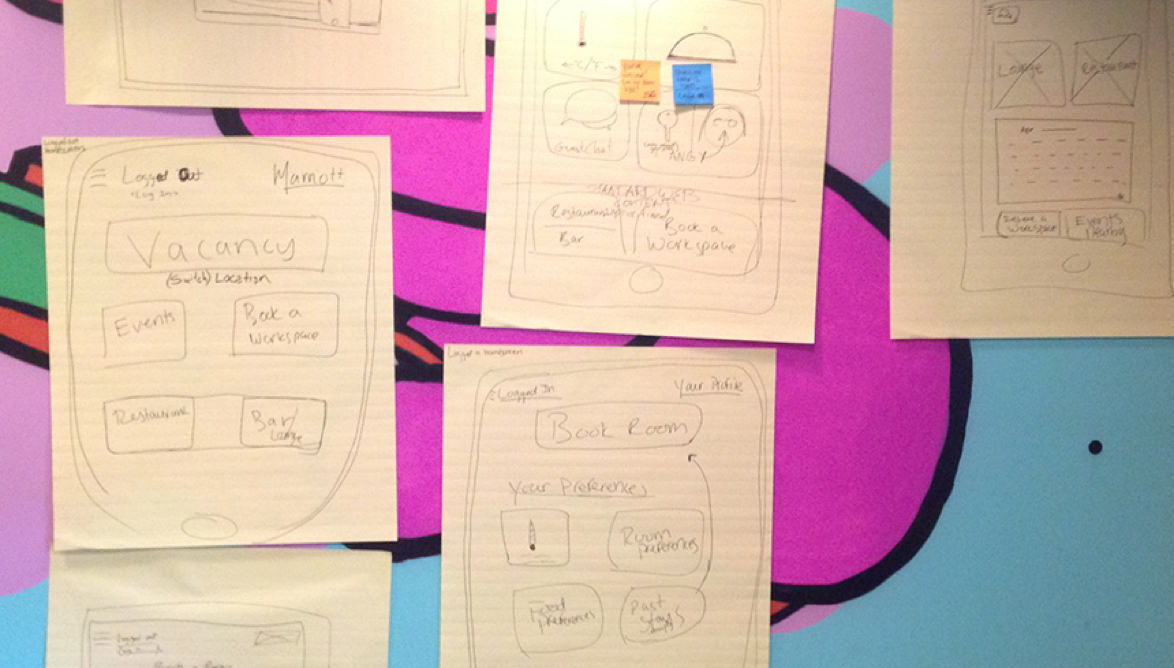
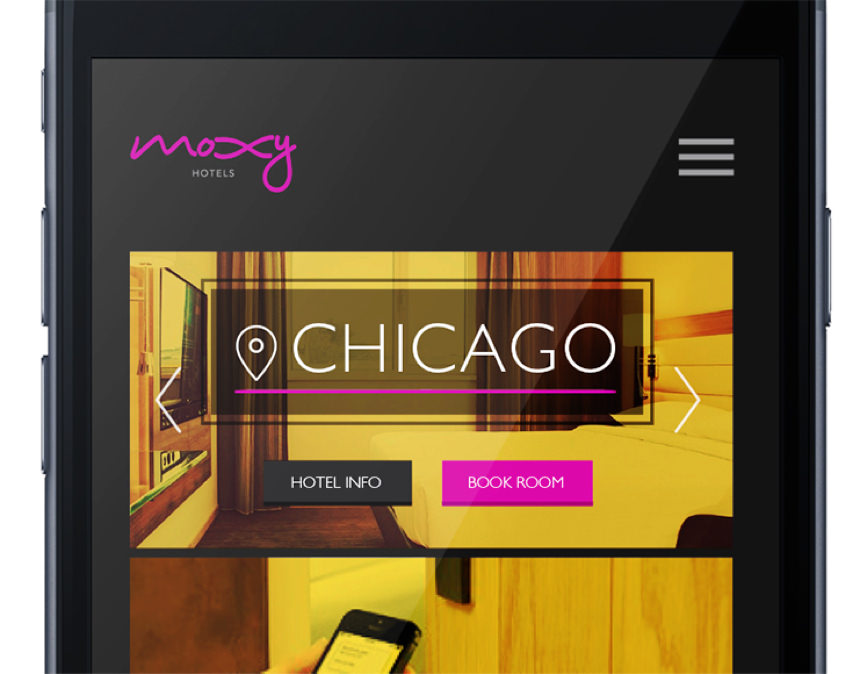
MOBILE FIRST: Given the emphasis on self-service and our users being an active, tech-savvy bunch, we opted to place emphasis on the mobile site.
KEEP IT SIMPLE: In an attempt to mirror the minimalist ideals of Moxy, as UI designer I created a minimal yet informative layout in order to maximize screen real estate.
INITIAL TESTING: In usability testing, we prompted our users to find various parts of the site which they accomplished with great success. However, users would go to the hamburger menu as a ‘catch-all’ when unsure what to do next. This was not an issue as the menu offers a path to any category on the site.
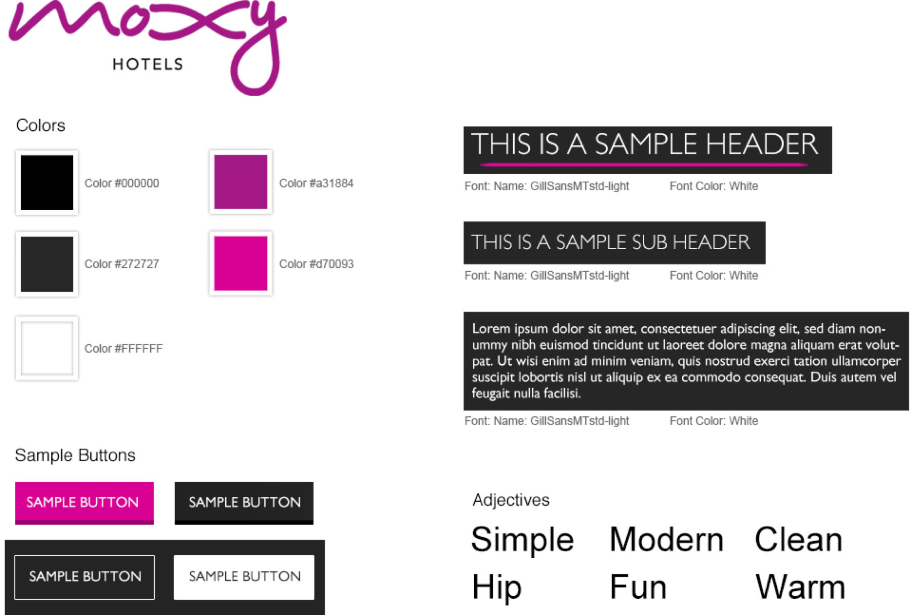
Style Tile: The look and feel of the site was already in good shape, so I left it as-is.
THE RESULT
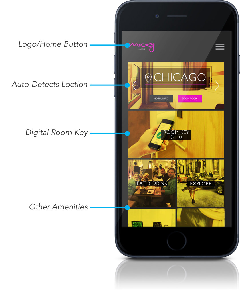
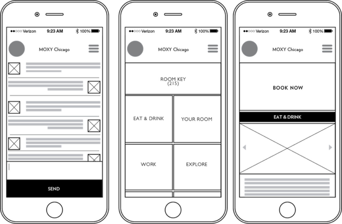
AMENITIES: We also needed to make sure guests were aware of all the amenities of the hotel including food-and-drink options, private workspaces, etc. In an effort to provide the utmost transparency and convenience, we opted to place this information directly on the homepage.
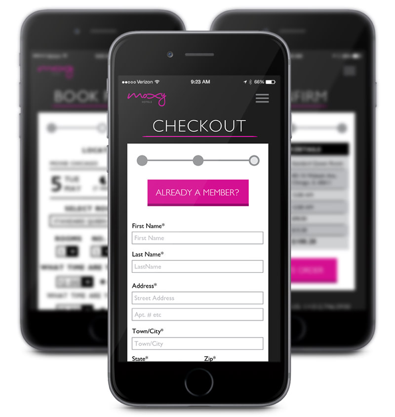
BOOKING A ROOM: We focused on details specific to our users, in particular the checkin/checkout process. Going back to our insight of self-service we wanted to make this process as simple as possible. If it was simple, it would reduce stress and increase productivity.
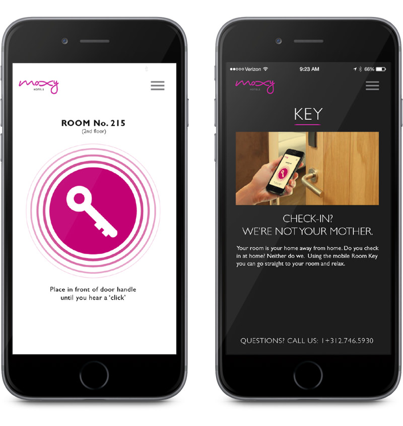
ROOM KEY: Most hotels insist your checking into at a front desk. But why? Our users value autonomy. With that we tell our user up front the room number they’ll have and even give them access to the room via digital key. Just come right in!
NEXT STEPS
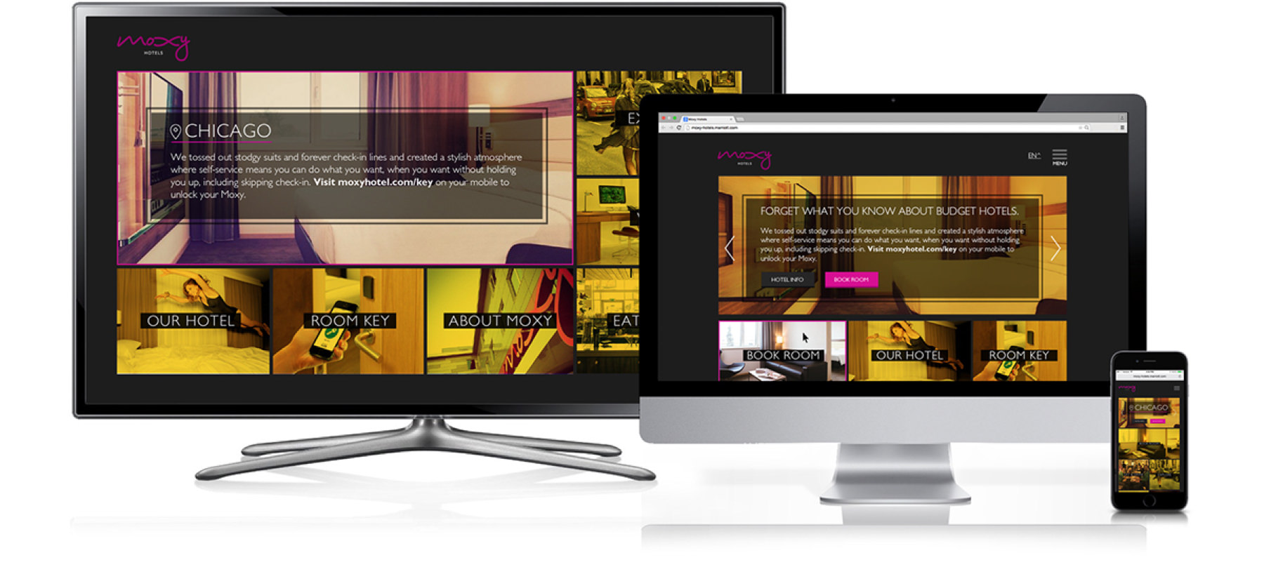
ALL SHAPES AND SIZES: As this was a short 2 week turnaround only the mobile app was fully designed and tested. However, in addition to further testing the mobile we were interested in exploring the tablet/desktop versions and how their responsiveness effected their use for the on-the-go business traveling millennial. Lastly, each hotel room comes with a 42 inch flat screen TV. As some hotels offer a ‘hotel channel’, we thought is may be interesting to turn your screen into a personalized site when you enter the room, complete with all the information Moxy has to offer right when you enter the room.